Searching for recipes on your phone can be frustrating—unclear instructions, disorganized results, and no way to filter by ingredients, time, or dietary needs. For Mirais Lácteos, I redesigned their platform to make finding the perfect recipe simple and stress-free.


Timeline: 1 month
Design a recipe platform for Mirais Lácteos, a dairy brand from Minas Gerais, Brazil, to promote its products through recipes while solving the frustration of cooking with disorganized recipes, unclear instructions, and no way to filter by ingredients, time, or dietary needs.

Challenge
Objectives
Understand the needs of people who use recipes.
Design a modern app that celebrates Minas Gerais traditions.
Identify and solve user pain points in the recipe-making process.

To understand users, I crafted questions to uncover their mental processes and used three key methodologies:
Interviews: Direct conversations to understand their recipe-making habits and pain points.
Observation: Watching how they used similar apps to identify frustrations and opportunities.
Beginner’s Mind: I cooked a recipe myself, adopting a beginner’s perspective to experience their challenges firsthand.

Research
What do I need to understand?
Insights
Through observation and firsthand exploration of recipe websites, I uncovered the main frustrations users face:
Overwhelming Choices: Too many recipes, but hard to find ones that match their ingredients, time, or dietary needs.
Disorganization: Search results are cluttered, and instructions are often unclear.
Inefficiency: The process feels frustrating, not because of a lack of options, but because of poor navigation and usability.
These insights highlighted the need for a platform that simplifies recipe discovery and makes cooking stress-free.


Based on my understanding of users, I created a proto-persona to guide the design. This persona will evolve as more research is conducted in future projects.
Maria, 40 years
A busy mom from Belo Horizonte with two kids, Maria wants to make quick, healthy meals using Mirais Lácteos products. She often struggles to find recipes with simple ingredients that fit her tight schedule. Overwhelmed by too many options and unclear results, she sometimes gives up entirely.
This persona helped me create a customer journey map, deepening my empathy for users like Maria and highlighting the need for a simple, efficient recipe platform.

Definition


I began with a brainstorming session, organizing ideas into two categories:
Yellow Post-its: User-focused ideas.
Pink Post-its: Business needs.
Using criteria like cost, business value, relevance, and user loyalty, I prioritized the most impactful ideas:
Filters: Let users find recipes by ingredients, time, expertise, or price.
Multiple Formats: Offer recipes in text, video, and step-by-step guides to reduce mistakes.
Dynamic Home: Show time-sensitive recipes (e.g., quick breakfast ideas in the morning).
Special Events: Curate recipes for holidays and occasions to keep users engaged.
Cultural Content: Highlight Minas Gerais traditions to help users connect with the brand.
These ideas formed the foundation of a platform that balances user needs with business goals.

Ideation


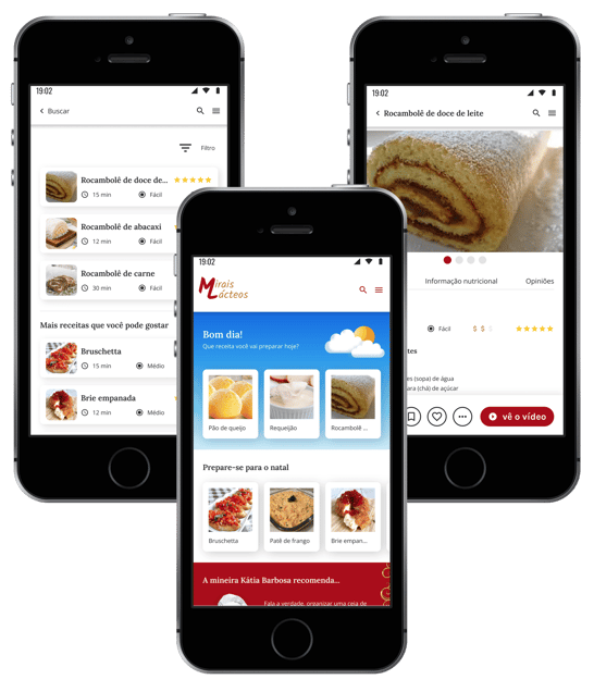
I created a low-fidelity prototype focusing on the “happy path”—the ideal user journey from the home screen to completing a recipe, including leaving comments and ratings. This ensured the interface was intuitive and functional.
How I Solved the Problems:
Overwhelming Choices:
Added filters for ingredients, difficulty, time, price, and category to help users find recipes quickly.
Disorganization:
Designed a dynamic home section with time-based suggestions (e.g., quick breakfast ideas in the morning).
Created event-specific sections (e.g., holidays) and categorized recipes (desserts, salads, meats, etc.).
Inefficiency:
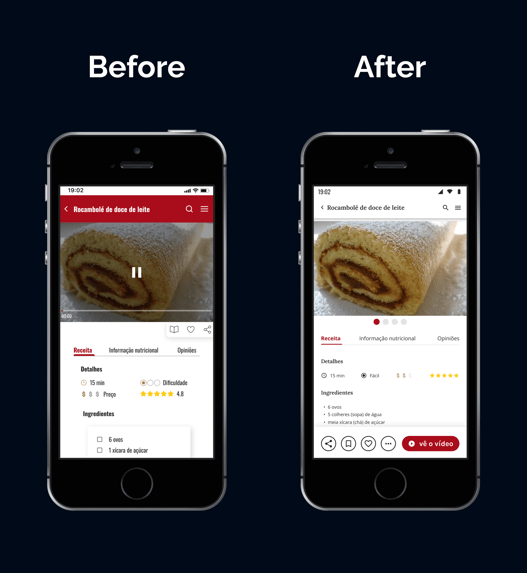
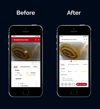
Offered multiple formats for recipes: step-by-step videos with pause functionality and text instructions.
Included ingredient lists for each step, showing quantities, so users don’t have to scroll back and forth.
These solutions made the app intuitive, efficient, and adaptable to users’ preferences, ensuring a seamless cooking experience.

Prototyping

I conducted usability tests with 5 target users to evaluate the platform’s effectiveness.
Key Findings:
Issue: The interaction for marking ingredients wasn’t clear, and the lack of instructions confused users. Combined with low-contrast colors (e.g., red backgrounds) and narrow typography, some text was hard to read.
Solution: I removed the marking feature, improved color contrast and changed typography for better readability.
Positive Feedback: Users loved the multiple recipe formats (video, text, step-by-step) and found it easy to navigate between the recipe, nutritional information, and reviews.
These insights helped refine the design, ensuring a more intuitive and accessible experience.

Testing
Cognitive walkthrough
For Mirais Lácteos, I led a sprint design to create a recipe platform that addressed user frustrations while aligning with the brand’s goals.
Problems Solved:
Disorganization & Poor Information Architecture:
Designed a dynamic home section with time-based suggestions and categorized recipes, making it easier for users to find what they need.
Overwhelming Choices:
Added filters for ingredients, time, difficulty, and price, simplifying the search process.
Inefficiency in Recipe-Making:
Introduced multiple recipe formats (video, text, step-by-step) and clear ingredient lists for each step, reducing errors and frustration.

Conclusion


See more proyects!


Ready to start a project or share your thoughts?
Reach out anytime, and I'll get back to you quickly. Let's create something amazing together!