Seeing restaurant managers struggle with complicated platforms and slow updates, I redesigned tumenuweb.com to make it easier for less tech-savvy users. I updated the website, app, and admin panel to be simple and intuitive, helping owners manage their restaurants better and grow their businesses.

Timeline: 3 months
Restaurant owners struggled with clunky delivery apps, leading to frustrated customers, high abandonment rates, and low platform engagement. My goal? Redesign three key interfaces to simplify the experience, keep customers happy, and help owners manage orders effortlessly.

Challenge
Objectives
Uncover pain points owners face with delivery apps.
Redesign the user flow—from landing page to first order.
Fix existing design flaws.
Make managing orders and businesses simple and accessible.

I began with a heuristic evaluation of the current platform, uncovering two major issues:
Inconsistent interfaces and unclear system statuses confused users.
Poor information organization led to mistakes and frustration.

Research
Heuristic Evaluation
Research
To dig deeper, I used observation and infiltration techniques during my time as a call center agent. Watching restaurant owners struggle revealed key insights:
Many owners weren’t tech-savvy, despite assumptions.
They preferred platforms that didn’t control their business but instead empowered them.
Most owners were in their 40s or 50s, needing simplicity and clarity.


To guide the redesign, I created two personas:
Juan Pérez
A fast-food restaurant owner who struggles with technology, missing opportunities to grow his business.
Adriana González
An administrator of a Colombian restaurant who turned to online sales during the pandemic but faced frustrating experiences with delivery apps.
These personas highlighted the need for a simple, empowering platform tailored to non-tech-savvy users.

Definition


After interviewing over 200 restaurant owners, I created a content briefing to outline our goals, target users, key promises, and their pain points.
Next, I designed a content prototype to map out how users would interact with the app based on our findings.
Finally, I crafted a user flow —spanning from the website and registration to the admin panel and first order—defining the information architecture and ensuring a seamless experience for owners and customers alike.

Ideation


I began by creating a style guide to ensure consistency in colors, buttons, fonts, shapes, and imagery across all platforms.
Next, I prioritized the most critical sections for each interface:

Prototyping
This was a challenging step because I made three different interfaces in a limited time with different paths the user could take to make their tasks. Fortunately, I made all three, and I continued to improve them over the years.
Problems
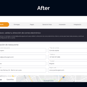
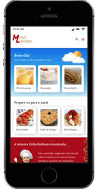
Website (Informational):
It was designed to clearly inform users about the platform. The sections in this interface are:
Home
Services
Prices
Demo
Contact
Help
Login/Signup.
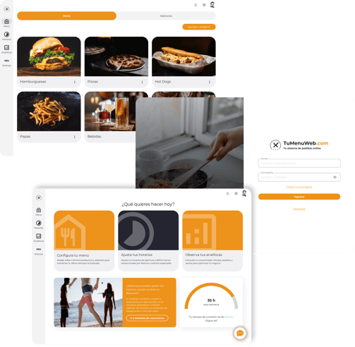
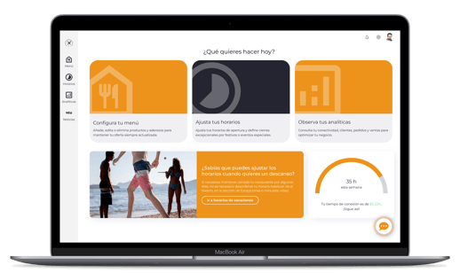
Platform (Management):
It was designed to let the users manage their restaurant settings.
The sections in this interface are:
Menu, Schedule, Analytics: Core sections for managing products, hours, and metrics.
News Section: For business updates, integrations, and service promotions.
Home: Features big buttons guiding users to core sections, a promotional card for additional services, and a connection status card.
Settings: A hub for activating functionalities like payments, reservations, delivery options, and invoice details.
Order App (Operations):
It was designed to let the users manage their restaurant orders.
The sections in this interface are:
Active Orders: Accept or decline orders (most critical section).
In Delivery: Track orders and contact customers if needed.
Reservations: Manage today’s or future bookings (if activated).
History: Review past orders or reservations.
Pause Activity: Temporarily stop orders during high demand.


I conducted usability testing with restaurant owners to validate the prototype. While the interfaces improved significantly, some features needed refinement.
What Worked:
Owners loved the admin panel suggestions that guided them on how to use the platform.
They appreciated the organized content across all platforms and the intuitive menu creation process.
What Needed Improvement:
Admin Panel: Sub-menus weren’t visible enough, and adding/modifying products was frustrating.
Order Panel: Icons were unclear, and users struggled to search for past orders.
These insights helped me identify key areas to refine before finalizing the design.

Testing

The Tu Menú Web project focused on improving the experience for restaurant owners, especially those less tech-savvy, by solving interface inconsistencies and usability issues.
Through research, persona creation, and iterative testing, we crafted a solution tailored to users like Juan and Adriana. Moving forward, continuous feedback and testing will ensure the platform remains effective and user-friendly.

Conclusion


See more proyects!


Ready to start a project or share your thoughts?
Reach out anytime, and I'll get back to you quickly. Let's create something amazing together!