Craigslist’s outdated design made buying and selling frustrating, while the lack of secure communication left users feeling uncertain and distrustful. Our team reimagined the platform as a modern mobile app, simplifying transactions and adding secure messaging to build trust and meet today’s digital needs.

Timeline: 1 year as a master's degree project
Redesign Craigslist’s outdated website to meet modern user needs, increase new user adoption, and improve customer satisfaction.

Challenge
Objectives
Redesign the platform based on user insights and perceptions.
Create a fresh, intuitive experience to help users make better buying and selling decisions.
Fix existing design problems to make the platform more user-friendly.

We began with a heuristic evaluation of Craigslist, uncovering critical usability issues:
No error prevention or recovery options.
Overwhelming and cluttered design, making it confusing and difficult to navigate.

Research
Heuristic Evaluation
Research
Next, we conducted 6 interviews with frequent buyers of second-hand products to understand their mental models and motivations.
Key Insights:
Communication is Key: Users want direct, secure communication with sellers to feel confident in their purchases.
Multimedia Matters: Detailed photos, videos, or GIFs of products build trust and help users make informed decisions.
These findings highlighted the need for a cleaner, more intuitive design with better communication tools and richer media options.


To guide the redesign, we created two personas based on user insights:
Mateo
A tech enthusiast who collects and resells gadgets. He needs to verify that the product matches the seller’s description and is priced fairly.
Cata
An artist who buys second-hand items to fuel her creativity on a budget. She values direct communication with sellers to confirm the product’s condition.
These personas helped us focus on creating a platform that builds trust, ensures transparency, and simplifies communication between buyers and sellers.

Definition
 1-dJo0okDk9ocMrM0L.svg)

To ideate our solution, we made a content briefing to discover the best way to communicate with users and take them until the last stage of the purchases.
We decided to:
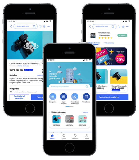
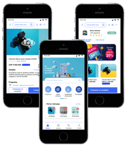
Allow the users to see all the content before login in to catch their attention first.
Put the contact button close to the “buy” button, so users can see it easily in case they have any questions.
Include 360° photos, so users could see the product in all the angles.
Make the purchase process on different screens to not overload the user.

Ideation


It was time to start sketching. We decided to make a mobile app because most of our users tend to use more their cell phones to make purchases.
Then we made the low-fidelity sketches with Miro. With Figma, we created the style guide (colors, type fonts, grids…).
And finally, designed the high-fidelity prototype. You can see the video on the left side.

Prototyping
-YNqLqke6Gwf0gGGR.gif)
Contact me to see the prototype in Figma, or visit my Behance profile to preview the UI Kit and some of the design.
To make the needed iterations, we made UX testing with 6 people.
We scheduled a short interview at first. Then, we put a context so they could make the task, and in the end, we talked about all the experiences with the prototype.
We had great reviews, during the test they didn’t make many mistakes and completed the task. But, we determined some points of improvement.

Testing


After all, we can say that we achieved the goal of the project: Redesign Craigslist according to the user's needs.
We solved the problem of distrust that users had by unifying the multimedia in the app.
We made the communication accessible by putting contact buttons on strategic screens.
We made a modern design that is more appealing to users.

Conclusion


See more proyects!


Ready to start a project or share your thoughts?
Reach out anytime, and I'll get back to you quickly. Let's create something amazing together!